
Type on Fire
Typographic Explorations.
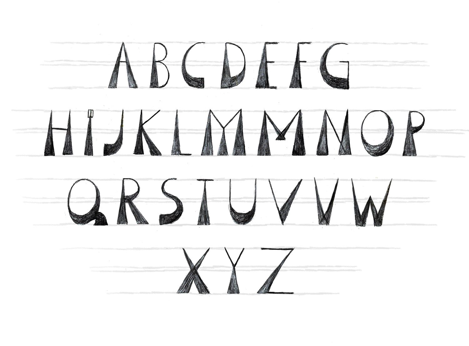
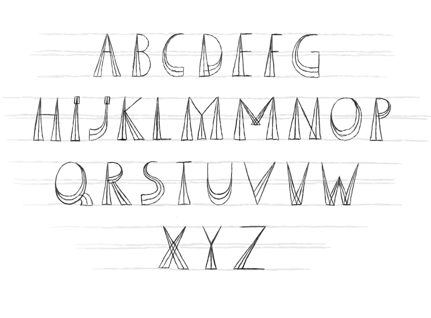
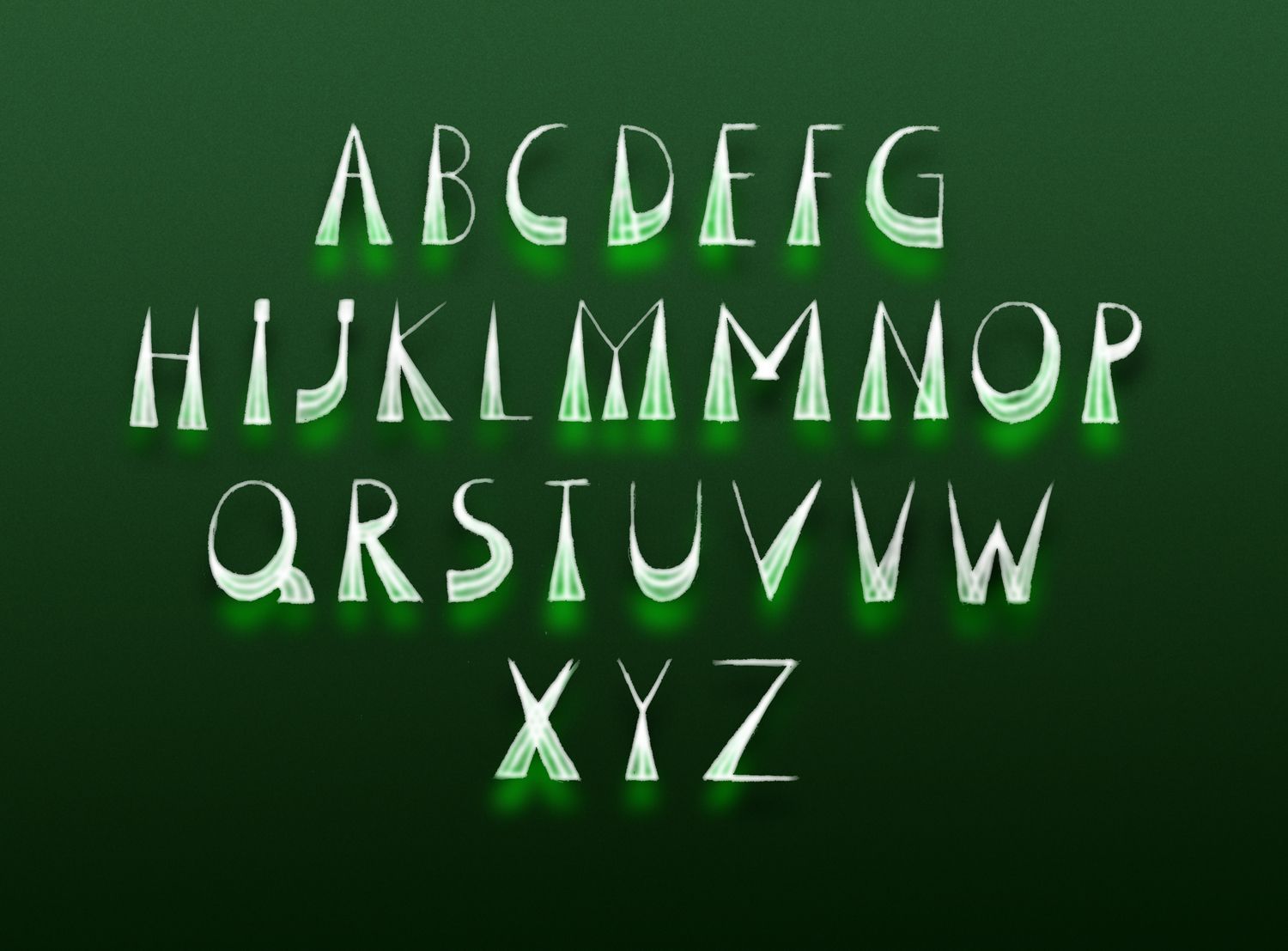
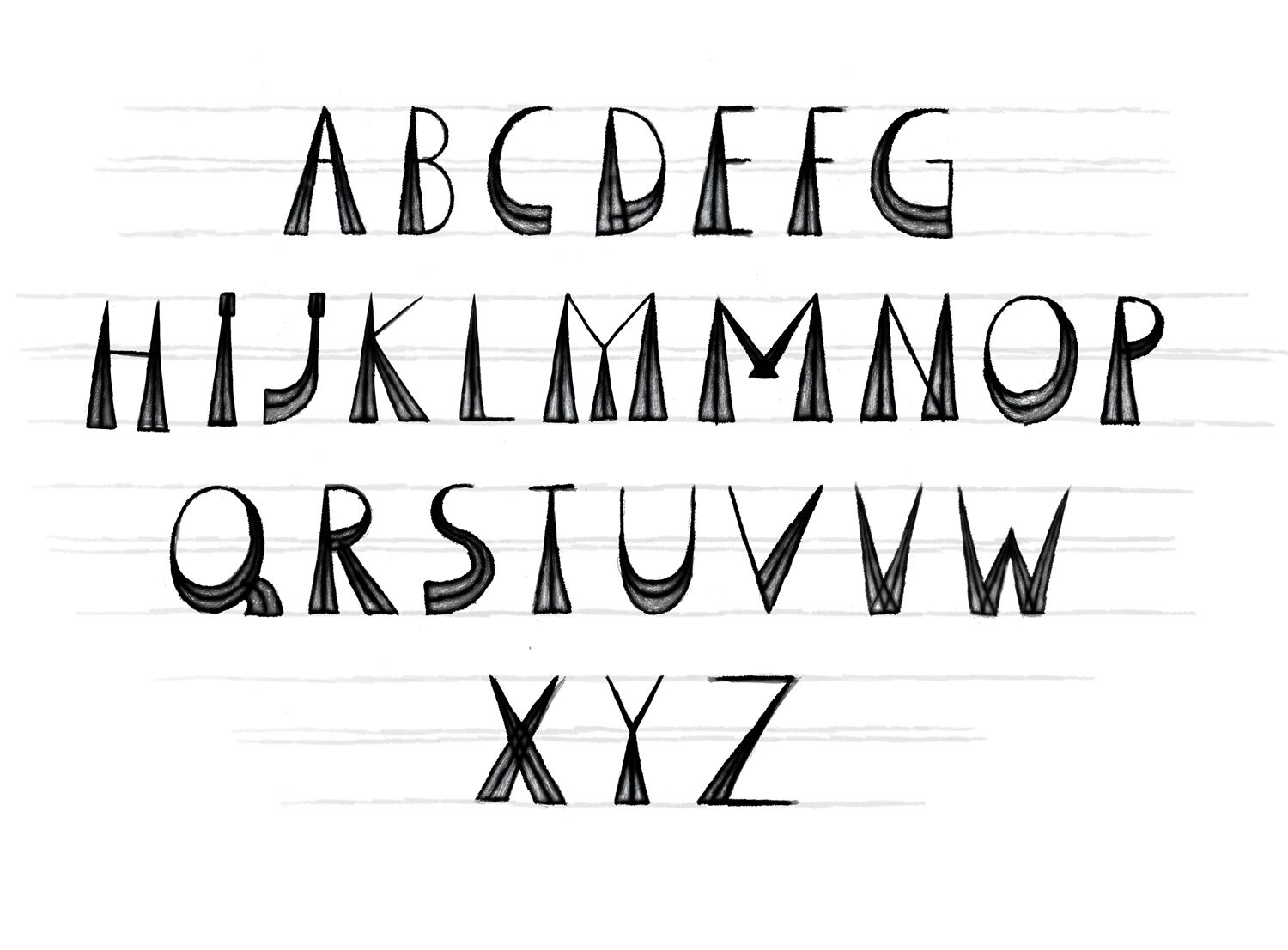
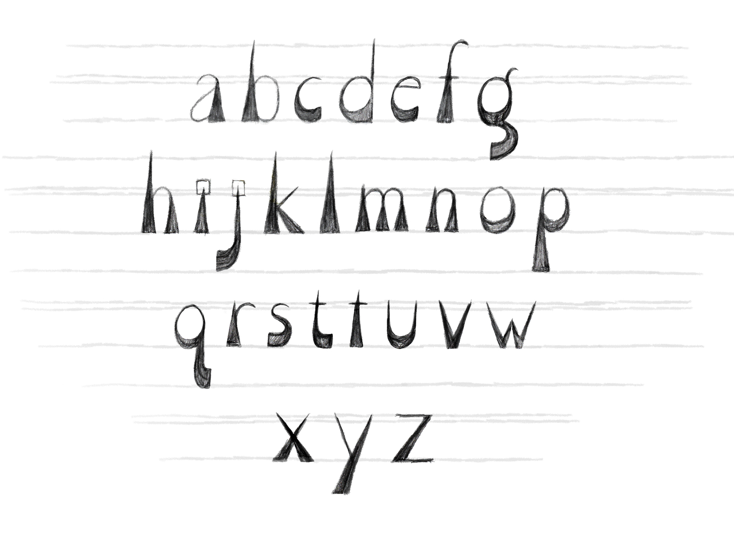
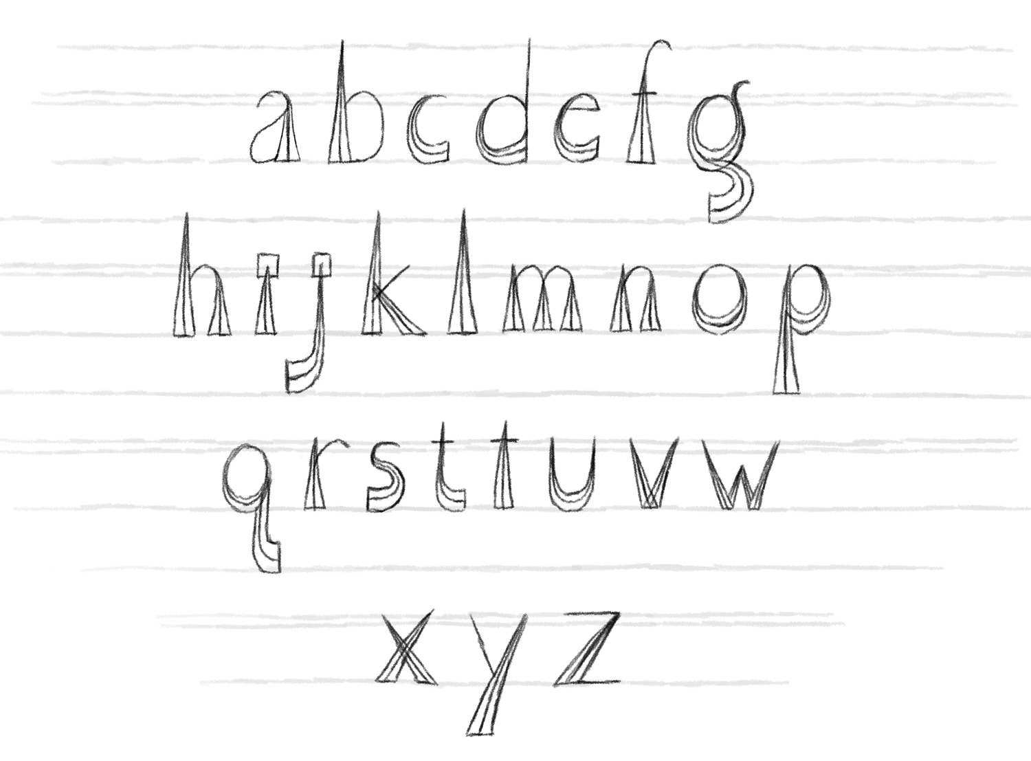
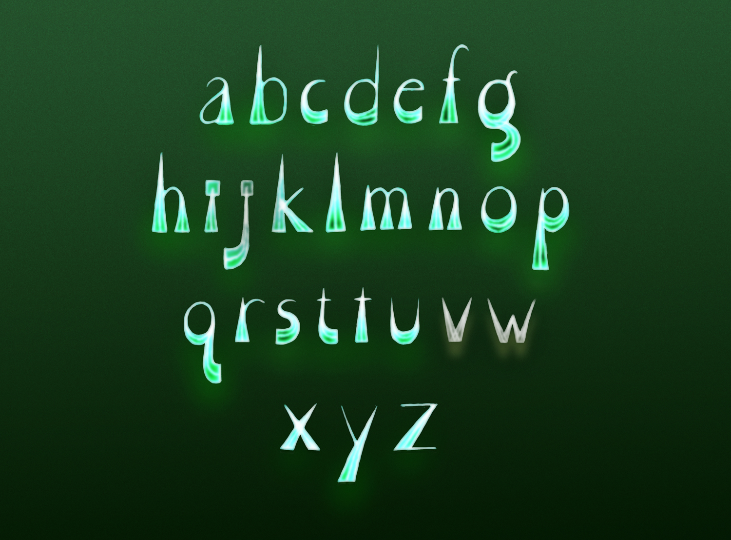
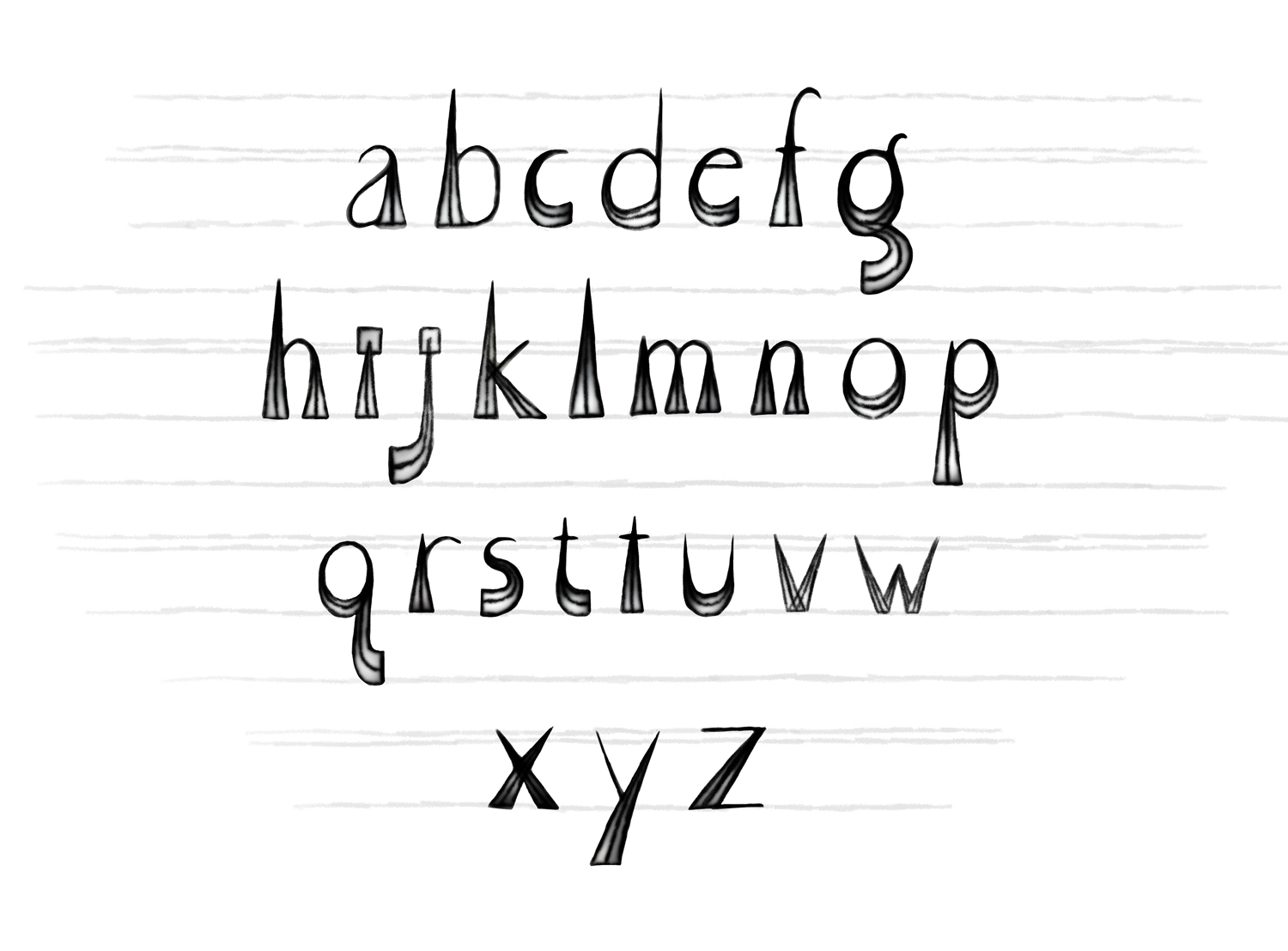
My love of letters came to me much later in life, as I’ve expressed in other posts. As a toddler, when I first saw the Roman Alphabet, I did not think the letters were beautiful. I played with a Fisher Price chalkboard and set of magnetic letters, Helvetica style. The thick straight lines, unbalanced asymmetries struck me as ugly and lacking the magic of languages like Chinese. When I finally began to love the alphabet, it was because I was drawing so much and occasionally, in my search for beauty, even making up letters of my own. I learned from my personal explorations that letters have patterns and that there is a balance in letters between individualism and conformity. If letters are too dissimilar, they do not work together beautifully. And if letters are too similar, they are too easily confused with one another and their identities blur. I began to respect rules as a source of beauty and harmony, through my explorations with letters.
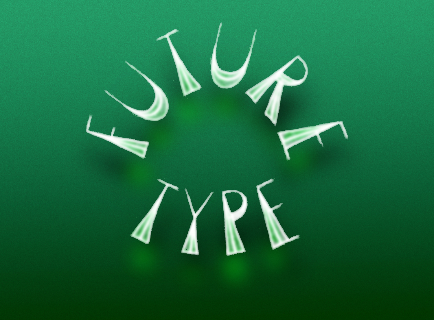
I’ve just pulled out some alphabets I made for the Future Type workshop with Tim Girvin at Everett College, Washington State, in 2012. Tim’s calligraphic hand flows as if it already knows, without study and observation, the curves and edges in the natural world. Finding the patterns of nature, in my own drawing, was a discovery process rather than a natural phenomenon. But that explorative process has been a joy for me, as much as it would be if I had always intuitively known those curves and angles.
_________________________________
November 2, 2012
Laura Maaske, MSc.BMC.
Biomedical Communicator
Medical Illustrator
Medical Animator
Health App Designer
![]()

